Choose from a wide variety of chart types to clearly and accurately display your data.
Maui Chart lets you experiment and instantly see the results. Effortlessly modify every aspect of your chart - change colors, styles, fonts, axes, gridlines, backgrounds, borders, legends, and more. Add or remove data series, adjust labels, fine-tune markers, and apply curve fits - all with just a few clicks.
As you make changes, your chart updates in real time, so you can quickly explore different looks and find the best way to present your data. Maui Chart was designed for creative experimentation, making it easy to discover the perfect visual for your needs.
Standard Charts
-
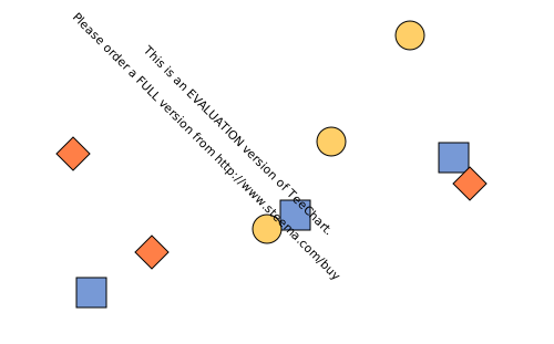
Scatter Chart
Plots individual data points on a two-dimensional grid to reveal relationships, clusters, and trends between two numeric variables. Ideal for correlation and distribution analysis.
-
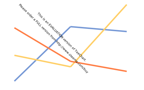
Line Chart
Connects a series of data points with straight lines, making it easy to visualize trends, changes, and patterns over time or ordered categories. Commonly used for time series data.
-
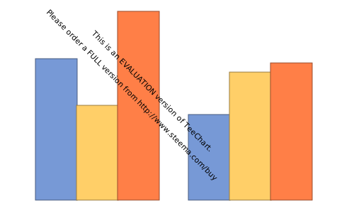
Bar Chart
Displays data with rectangular bars, to compare values across categories. Multiple style options support grouped, stacked, 100% stacked and 3D bars with depth for flexible comparisons.
-
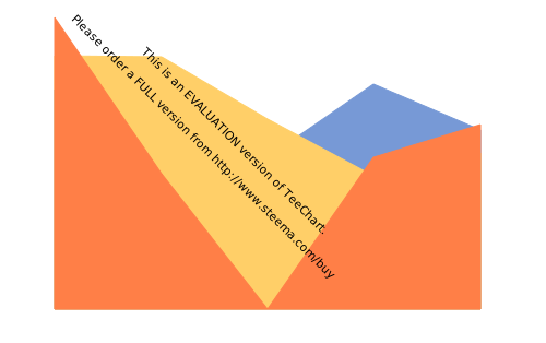
Area Chart
Fills the area below a line chart to emphasize the magnitude of values over time or categories. Useful for showing cumulative totals, proportions, and part-to-whole relationships. Multiple style options support overlay, stacked and 100% stacked
-
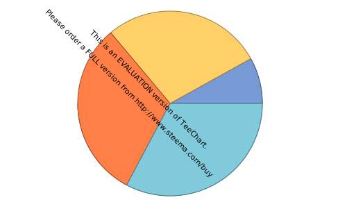
Pie Chart
Divides a circle into slices to illustrate numerical proportions of a whole. Each slice represents a category's contribution, making it easy to compare parts to the total.
-
Donut Chart
A variation of the pie chart with a central hole, allowing for multiple series or additional information in the center. Great for visualizing proportions and multi-level data.
-
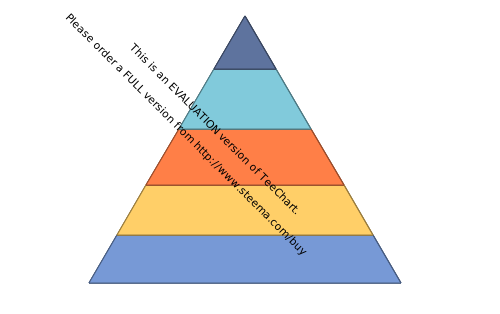
Pyramid Chart
Visualizes hierarchical or population data in a pyramid shape, often used for age distributions, organizational structures, or process stages.
-
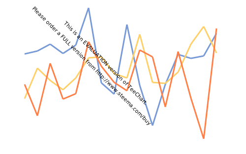
Fast Line Chart
Optimized for rendering large datasets, this line chart provides high performance and smooth interaction even with millions of points. Ideal for real-time and big data scenarios.
Radial Charts
-
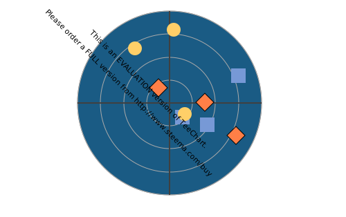
Polar Chart
Plots data using polar coordinates, with values represented by angles and radii. Useful for visualizing cyclic phenomena, such as seasonal trends or periodic signals.
-
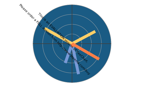
Polar Bar Chart
Arranges bar charts in a circular (polar) layout, making it easy to compare values around a central point. Great for displaying periodic or directional data.
-
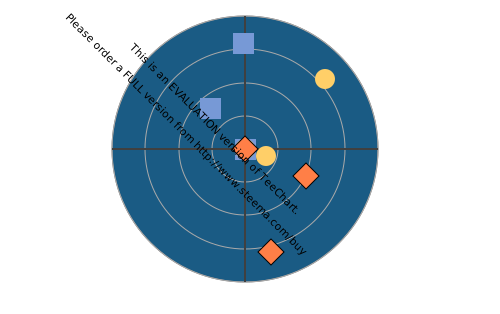
Rose Chart
Displays data in a circular format, with each segment's length representing magnitude. Commonly used for wind, directional, or frequency data in meteorology and engineering.
-
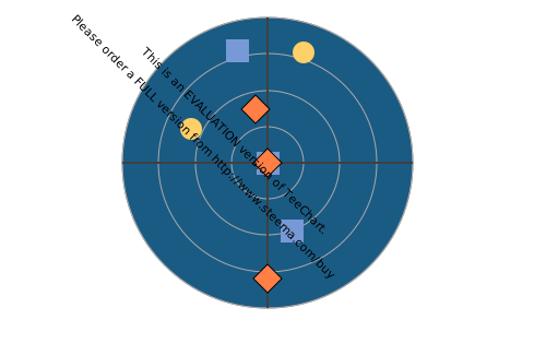
Wind Rose Chart
A specialized rose chart for visualizing wind speed and direction frequencies. Each segment shows how often wind blows from a particular direction at certain speeds.
-
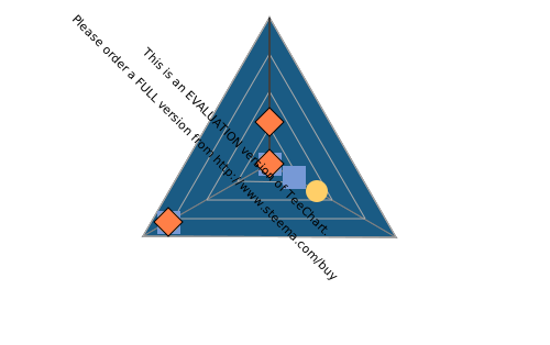
Radar Chart
Shows multivariate data with axes radiating from a central point, forming a web-like shape. Useful for comparing multiple variables or performance metrics at a glance.
-
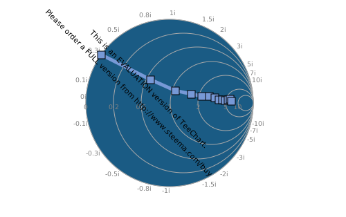
Smith Chart
Used in electrical engineering to plot complex impedance or admittance, the Smith chart is essential for RF and microwave circuit analysis and design.
Advanced 3D Charts
-
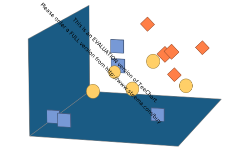
Scatter 3D Chart
Plots data points in three dimensions, allowing you to explore relationships among three variables. Ideal for scientific, engineering, and statistical analysis.
-
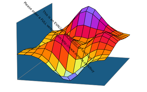
Surface 3D Chart
Displays a three-dimensional surface connecting data points, making it easy to visualize topography, response surfaces, or mathematical functions.
-
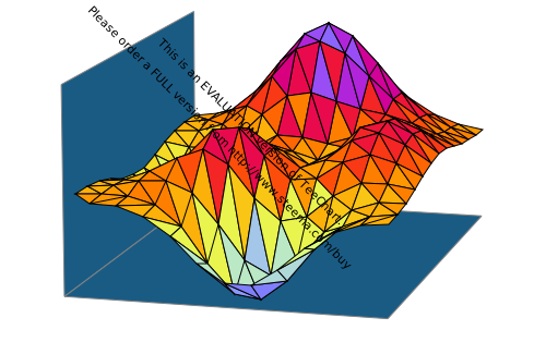
Tri-Surface 3D Chart
Renders a 3D surface from triangular mesh data, supporting complex geometries and irregular datasets. Useful for scientific and engineering visualization.
-
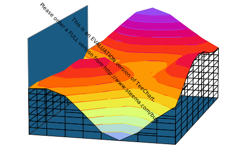
Iso-Surface 3D Chart
Shows surfaces of constant value within a 3D volume, often used in scientific visualization to represent boundaries, concentrations, or isovalues.
-
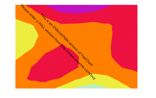
Contour Chart
Uses lines to connect points of equal value, often for mapping elevation, density, or temperature. Essential for topographic and heatmap visualizations.
-
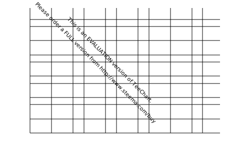
Heat Map Chart
Represents data values as colors in a grid, highlighting patterns, intensity, and correlations. Great for visualizing matrices, correlations, and spatial data.
-
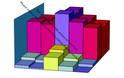
Tower 3D Chart
Displays 3D columns to represent values in a grid or matrix, making it easy to compare magnitudes and distributions in three dimensions.
-
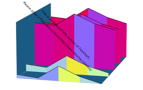
Waterfall 3D Chart
Shows cumulative effects of sequential values in three dimensions, often used for financial, engineering, or scientific data analysis.
Statistical Charts
-
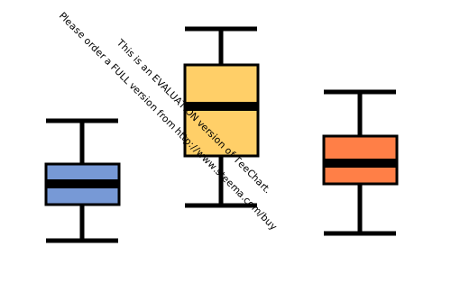
Box & Whiskers Chart
Summarizes data distribution with quartiles, median, and outliers. Useful for identifying spread, skewness, and potential anomalies in datasets.
-
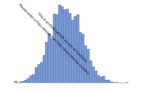
Histogram Chart
Displays the frequency distribution of a dataset using adjacent bars. Ideal for visualizing the shape, spread, and central tendency of data.
-
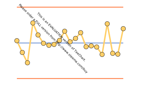
QC Chart (SPC)
A suite of quality control charts for monitoring process variation and control, including NP, P, C, U, XBarR, R, XBarS, S, I-MR and MR. Essential for manufacturing and quality assurance.
-
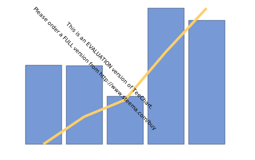
Pareto Chart
Combines bars and a line to highlight the most significant factors in a dataset, following the 80/20 rule. Helps prioritize issues or opportunities.
-
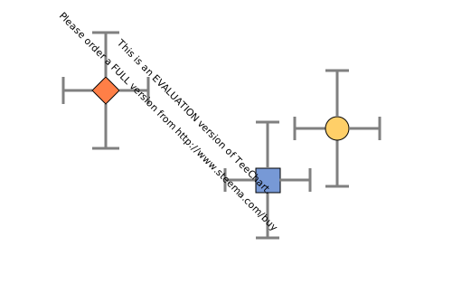
Error 2D Chart
Shows variability or uncertainty in data with error bars in two dimensions. Useful for scientific, engineering, and experimental data analysis.
-
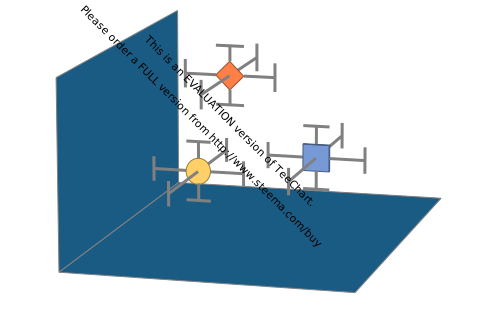
Error 3D Chart
Extends error bars to three-dimensional data points, providing a comprehensive view of uncertainty in complex datasets.
-
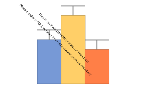
Error Bar Chart
Adds error bars to other chart types to indicate variability, measurement error, or confidence intervals. Enhances the reliability of data interpretation.
Financial Charts
-
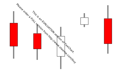
Candle Chart
Used in financial analysis to show open, high, low, and close values for trading periods. Essential for technical analysis and trend identification in stock markets.
-
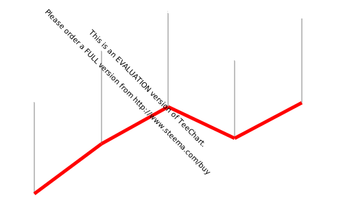
High-Low Chart
Plots the highest and lowest values for each period, often used in stock charts to visualize price ranges and volatility.
-
Volume Chart
Displays trading volume as bars, often combined with price charts to provide context for market activity and liquidity.
-
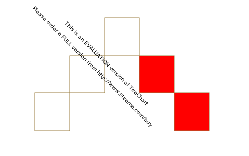
Renko Chart
Focuses on price movement by filtering out minor price changes, making trends and reversals more apparent. Useful for trend analysis and trading signals.
-
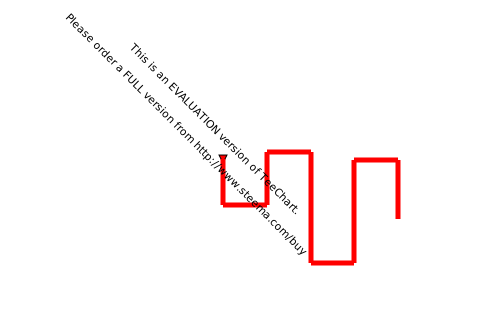
Kagi Chart
Emphasizes price reversals and trends, ignoring time and volume. Helps traders identify support, resistance, and trend direction.
-
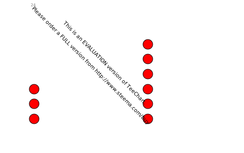
Point & Figure Chart
Shows price movements without regard to time, highlighting trends and reversals. Useful for long-term market analysis and breakout detection.
-
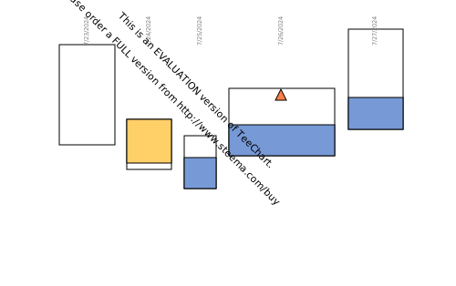
Equi-Volume Chart
Combines price and volume into a single chart, with bar width representing volume. Offers a more complete view of market dynamics.
-
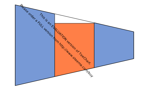
Funnel Chart
Visualizes stages in a process, such as sales or conversions, with decreasing values at each stage. Useful for identifying bottlenecks and drop-off points.
Other Charts
-
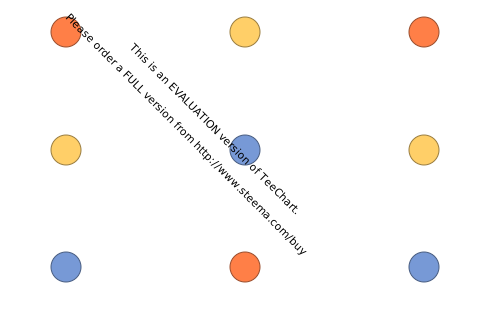
Slopes Chart
Visualizes the rate of change between data points, making it easy to compare growth, decline, or transitions across categories or time.
-
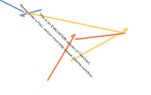
Vector 2D Chart
Displays vectors (arrows) in two dimensions, representing both direction and magnitude. Useful for physics, engineering, and flow analysis.
-
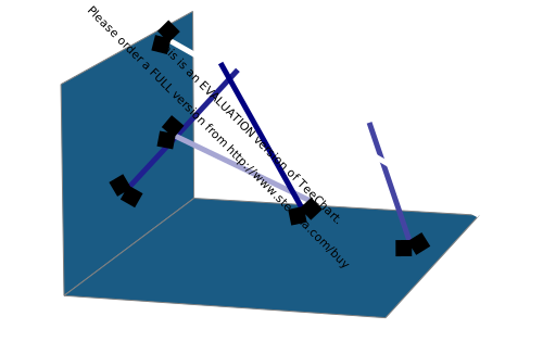
Vector 3D Chart
Extends vector visualization to three dimensions, allowing for more complex representation of direction and magnitude in scientific and engineering data.
-
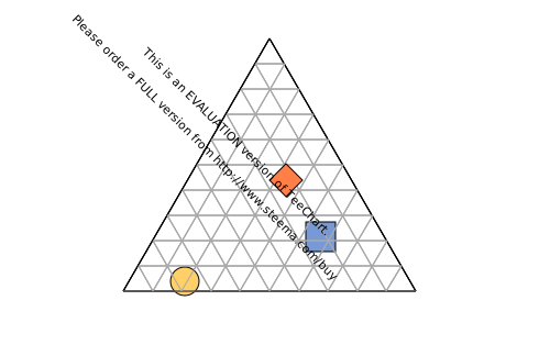
Ternary Chart
Plots compositions of three variables that sum to a constant, often used in chemistry, geology, and material science to show mixture ratios.
-
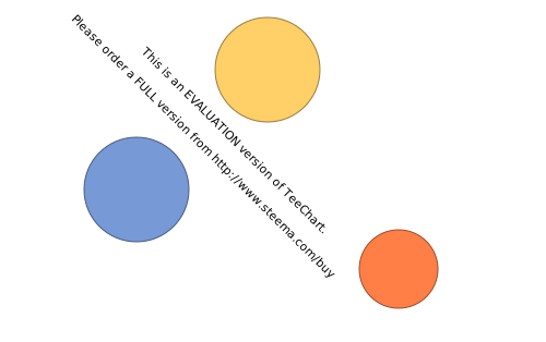
Bubble Chart
Shows three dimensions of data using x, y, and bubble size. Useful for visualizing relationships and distributions with an additional variable.
-
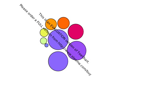
Bubble Cloud Chart
Visualizes data as a collection of bubbles, with size or color representing value. Great for highlighting key items in a dataset or word clouds.
-
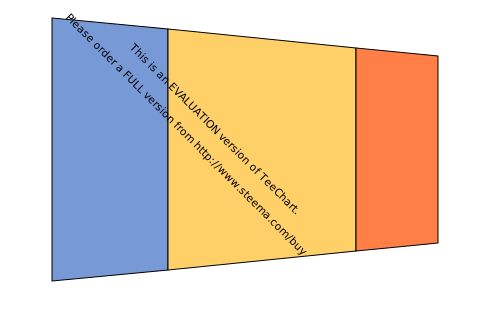
Volume-Pipe Chart
Represents data as pipes or tubes, often for flow, volume, or network visualization in engineering and scientific applications.
-
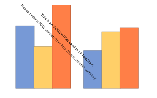
Image-Bar Chart
Uses images instead of bars to represent values, adding visual interest and context to data comparisons.